Spar
A Universal in-house brand reposition and packaging redesign.
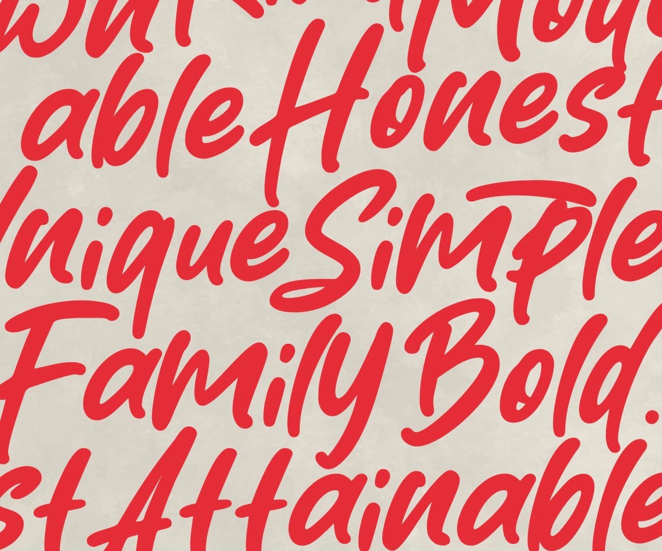
The SPAR Core range has undergone a total redesign and refresh to reposition, redesign and give better identification to the product assortment. The packs now communicate the consistency and transparency of the SPAR brand values. It is distinctive, purposeful and has a warm family feeling.
The product photography is singular and tasty, and the colours are warm and organic with texture. The line is now easy to navigate and looks as qualitative as the product inside, whilst capturing the attainable, friendly feeling that the brand is known for.
To support the packaging design I created a simple guide for usage of assets and rolling out the design across the range.


