Hartog
A complete strategy, branding and packaging redesign with supporting media through print and digital advertising.
Hartog horse and agriculture feed called for a complete brand refresh for their strategic identity, print and packaging design and online presence.
Together, Francesca Newman and I created a strategy that better portrays the story of the Hartog Family Farm. The new brand and strategy better shows their compassion for horses, knowledge of animal nutrition and innovative product creation. This now reads clearly and proudly from their print to packing design and online presence.
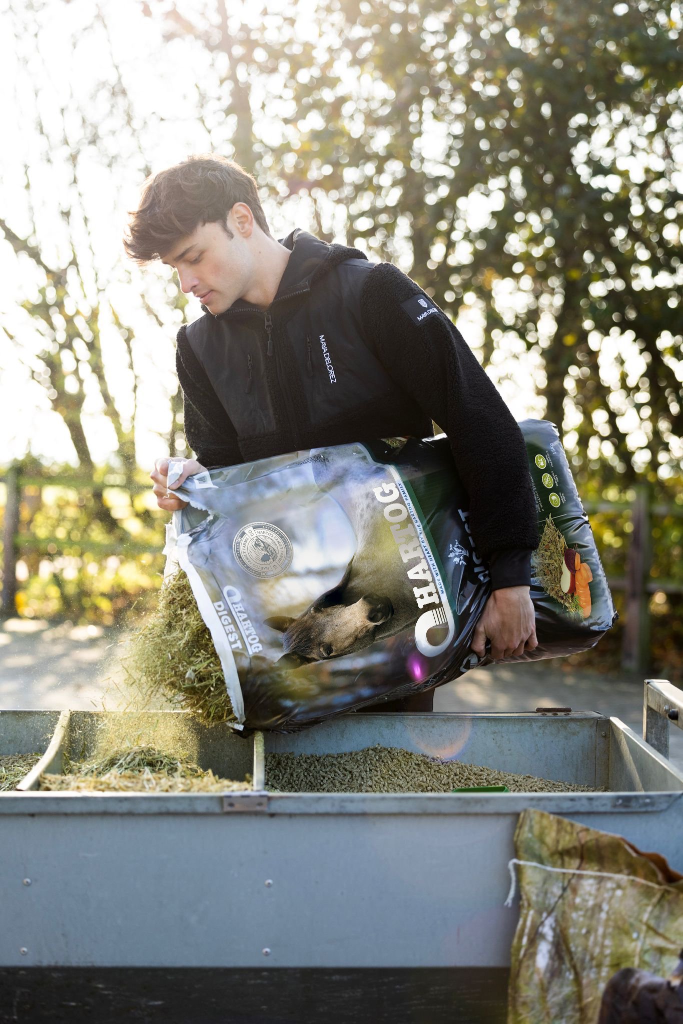
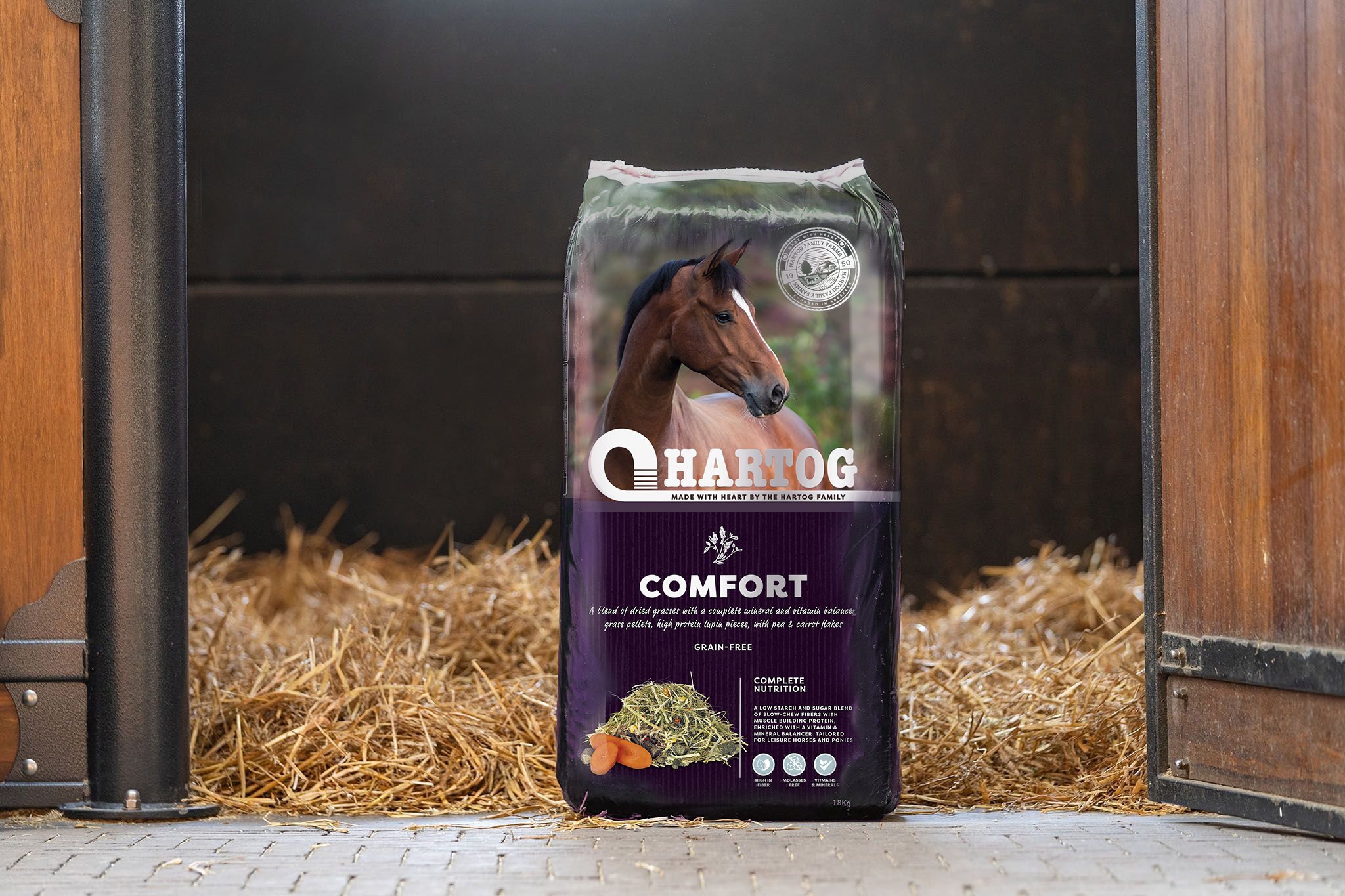
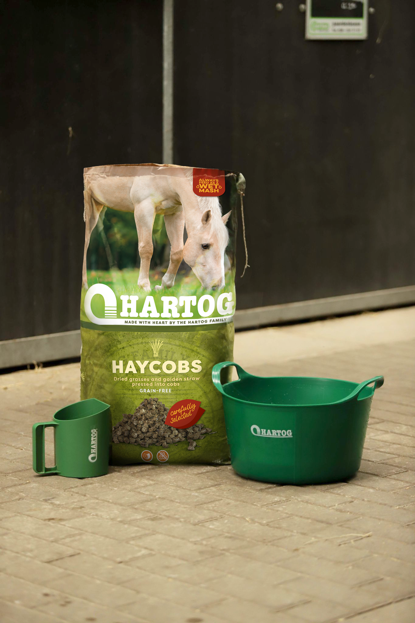
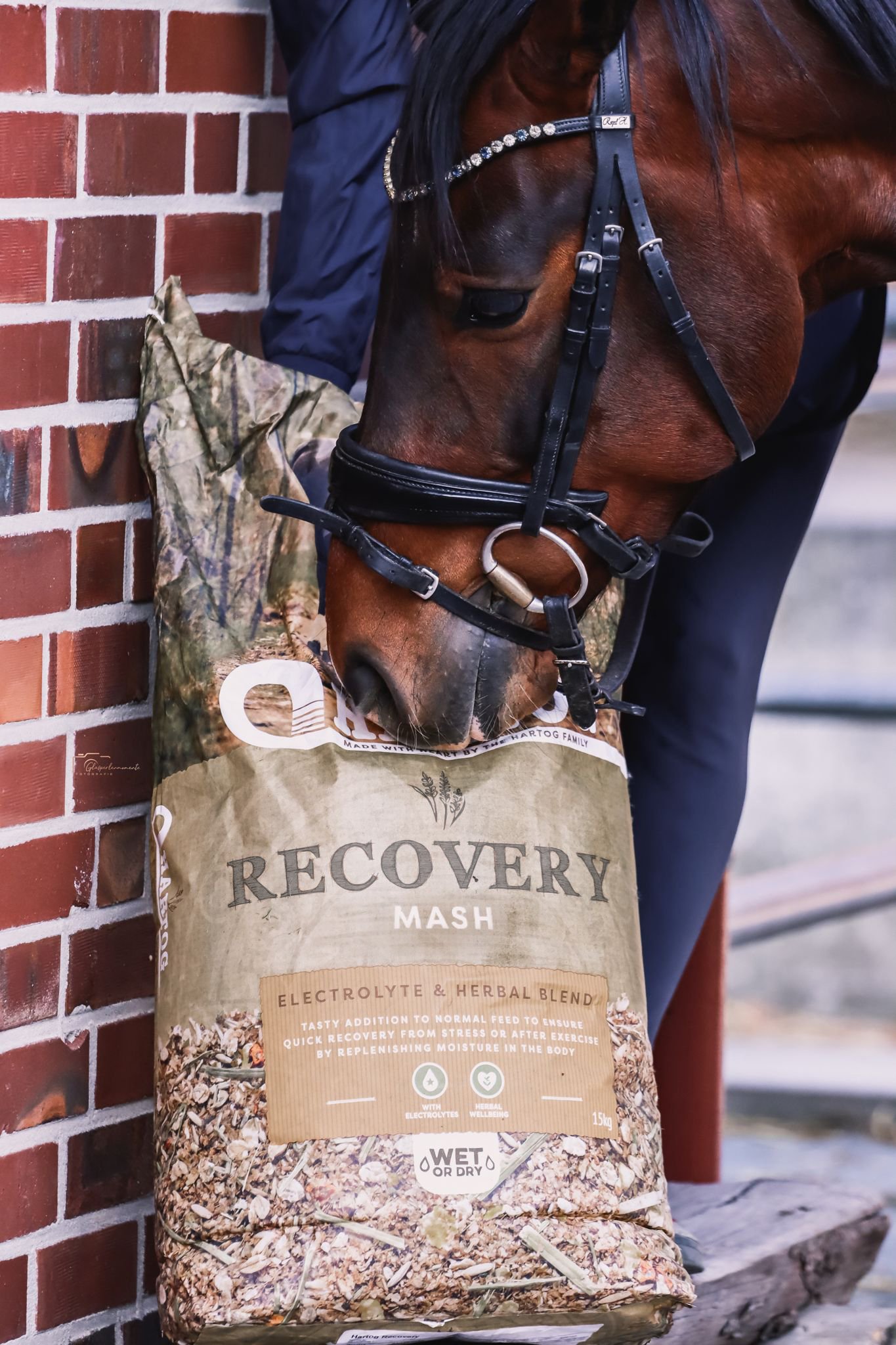
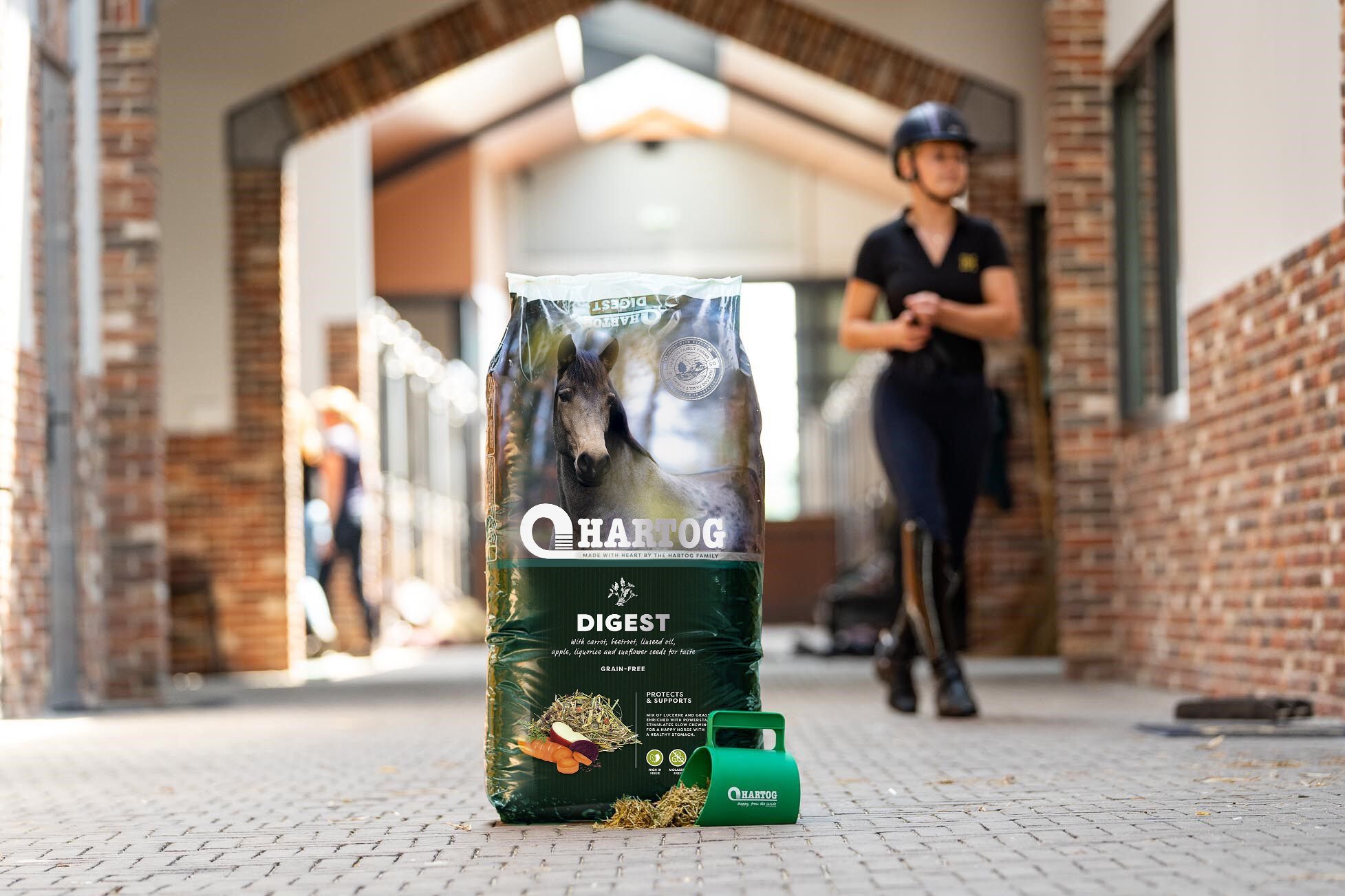
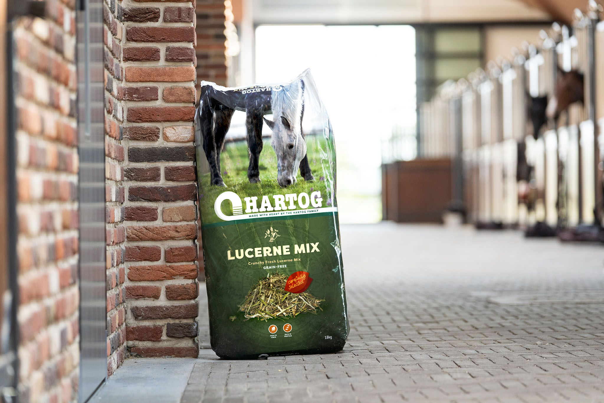
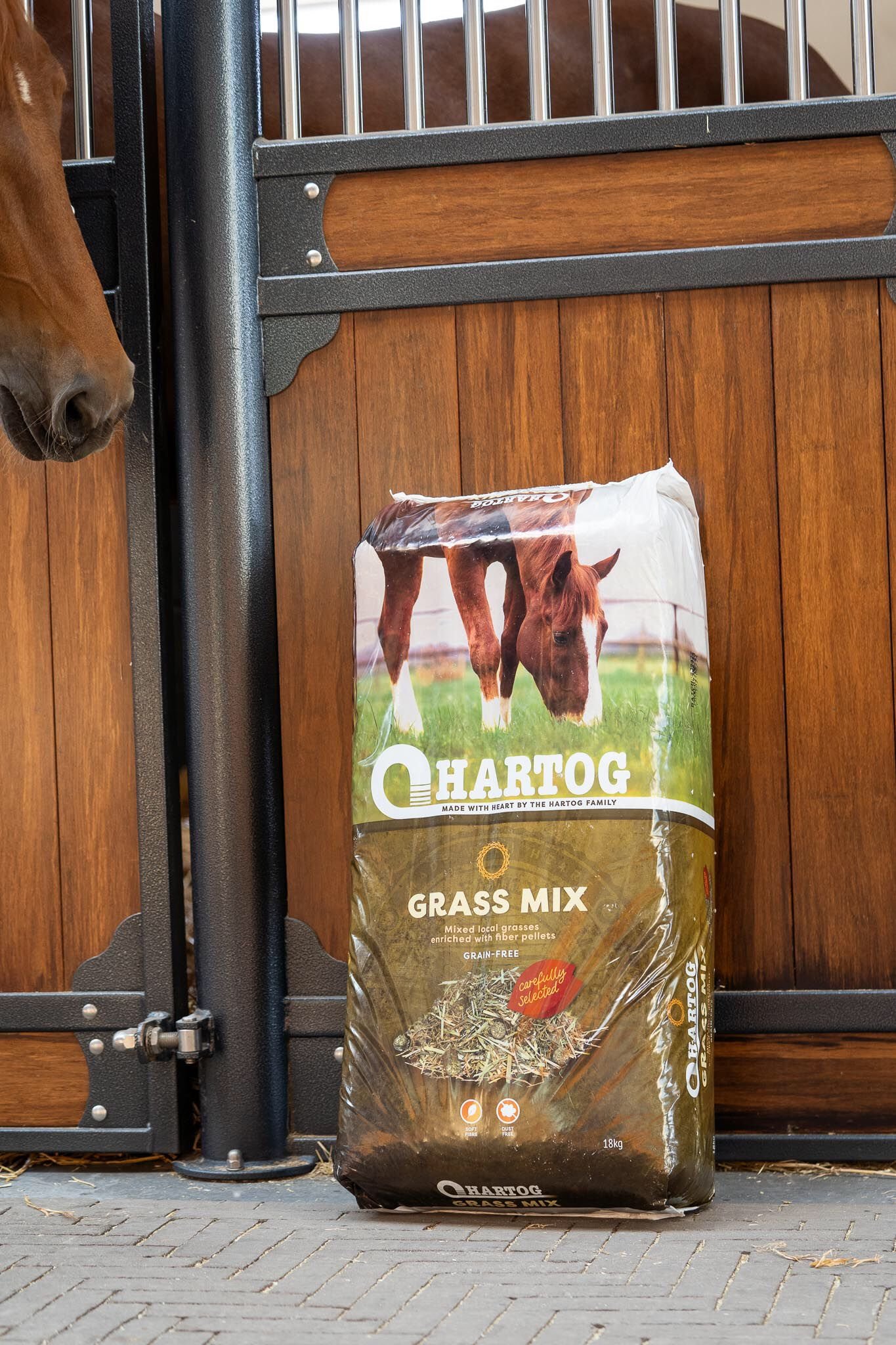
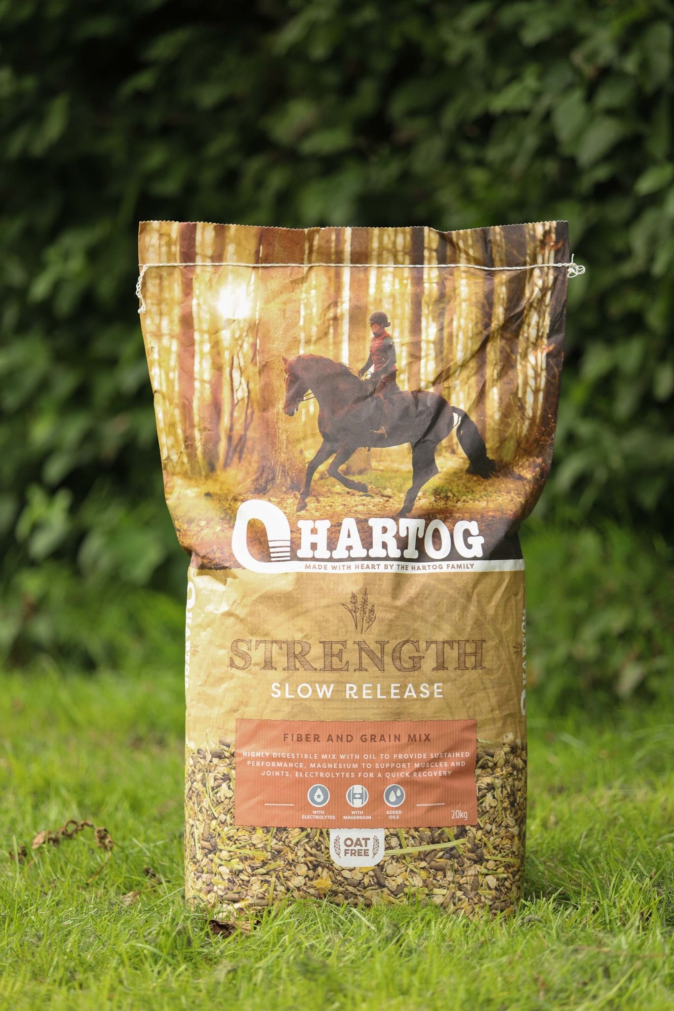
The new brand design and strategy breaks out of what is traditionally seen within the category. Hartog now has a more “pet-food” style, to better reflect the love owners have for their horses. It is warmer, friendlier and more foodie. The new strategy and design speaks more clearly to the family feeling that lives and breathes within the company. The same feeling Hartog buyers have for their horses.
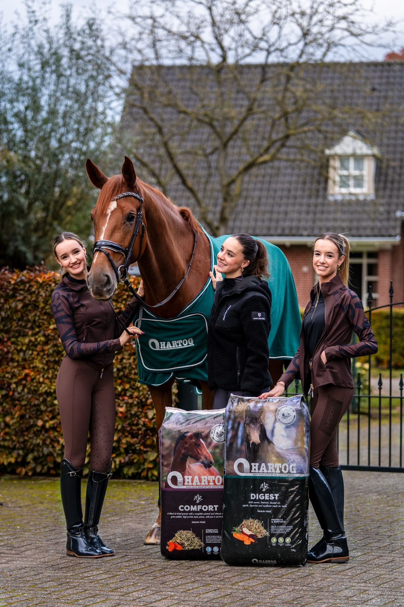
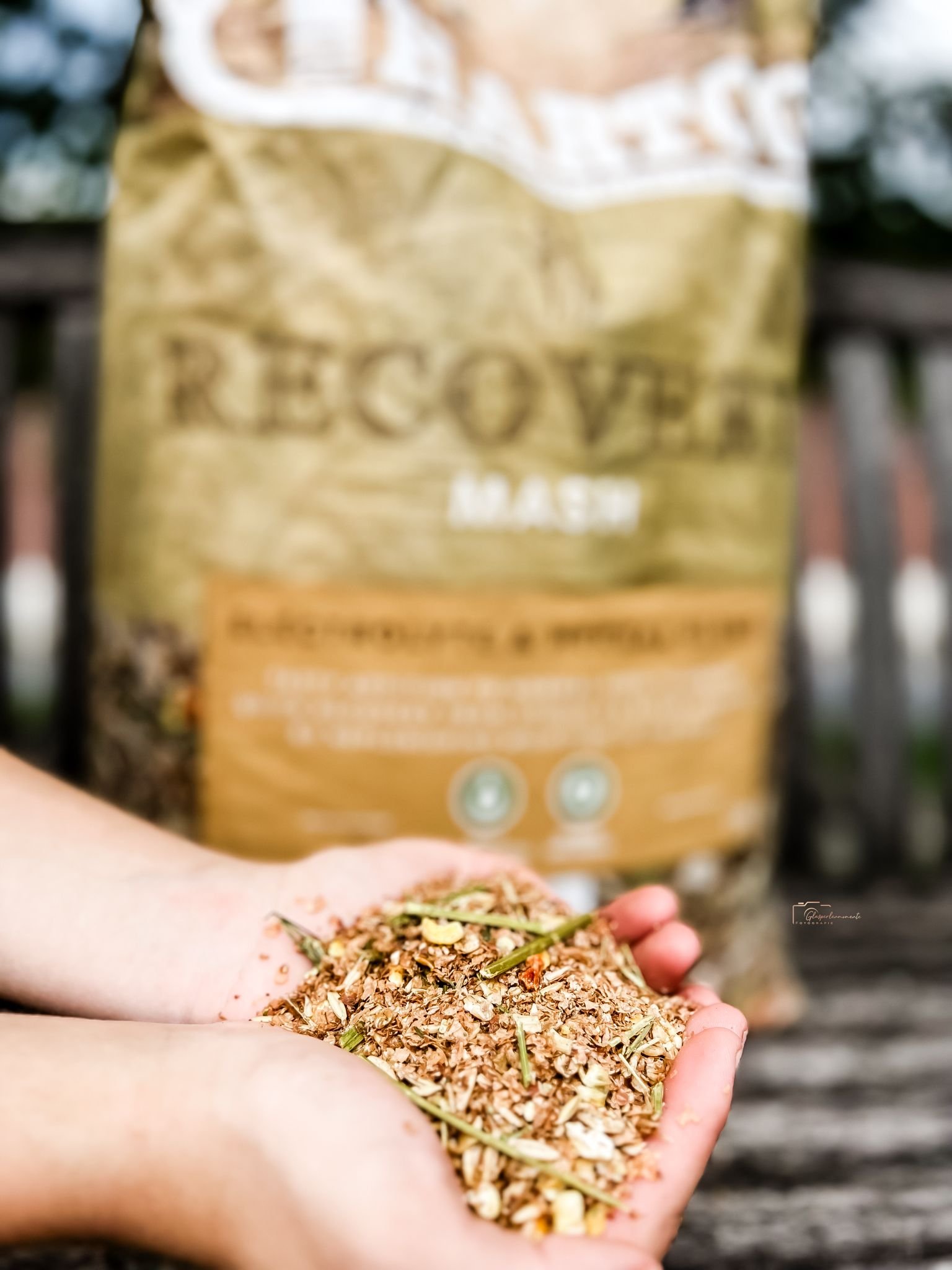
The brand is made up of earthy, textured colours, friendly typography and simple supporting iconography and illustrations. This is teamed with tasty product photography and beautiful shots of horses. The “Faces of Hartog” were selected through a competition on social media, where we found some of the most beautiful and dedicated Hartog-consuming-horses to appear on pack.
The finishing element for Hartog is a family crest which honours the heritage and home of the product and stamps each bag as a symbol of pride, love and quality.
“Being Happy on the outside starts with feeling happy on the inside”
Art direction
The website also called for a complete redesign and structure to compliment the new branding, strategy and story. And of course to show off the new packaging design.
Art Direction: Ashley Gifford Creative
Design and build: Tom Piggot


